LAKESIDE RESIDENCE
Bellevue, WA
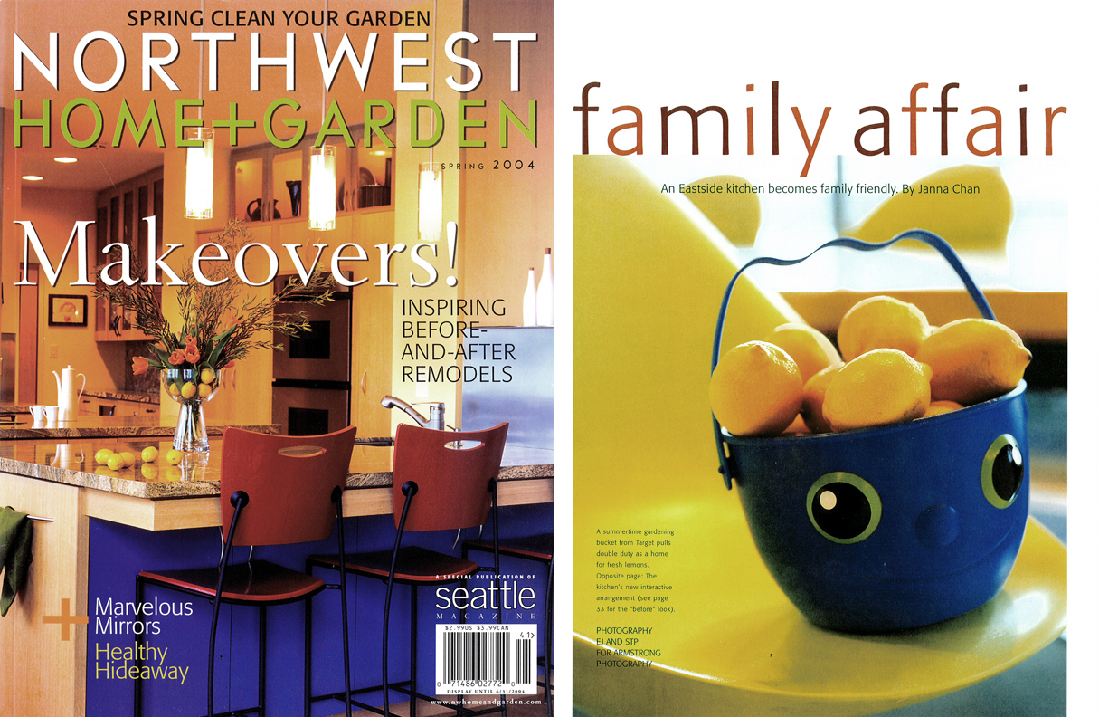
'When Linda & Cameron bought their 5,500 square-foot Bellevue home, they were impressed by the sleek, sedate colors of the kitchen. But, with their first daughter on the way, and eventually two more daughters in the next two years, the couple soon realized that "modern and upscale" didn't impress a toddler armed with crayons. A full-time mother, Linda spends nearly 80 percent of her time at home in the kitchen area with her daughters. The previous kitchen, while beautiful, didn't function logically for a large family. The layout of most of the major appliances, such as the dishwasher, sink and microwave, caused congestion. The refrigerator door opened into the walkway, often blocking entry into the kitchen, and a 5-foot high partition wall separated mom from where the girls would be playing. "I'm only 5 feet 4 inches, and I couldn't see over the wall to check what the children were doing in the family room," explains Linda. "So, if anyone squeaked I would have to run a pattern. I felt like a quarterback."
The couple decided to bring SZ on board to assist. SZ started off by drawing a few diagrams demonstrating the areas of congestion. It quickly became obvious that the problems in the kitchen would require more than merely moving a dishwasher - it would require moving everything.
Construction was completed in a short eight weeks, with the main goal for SZ to provide a family-friendly kitchen that could still function as a stylish, adult space. "Linda and Cameron knew exactly what they wanted," says Zahr. "They wanted to warm up the colors of the kitchen, make access to appliances more convenient and utilize the beautiful view of Lake Washington."
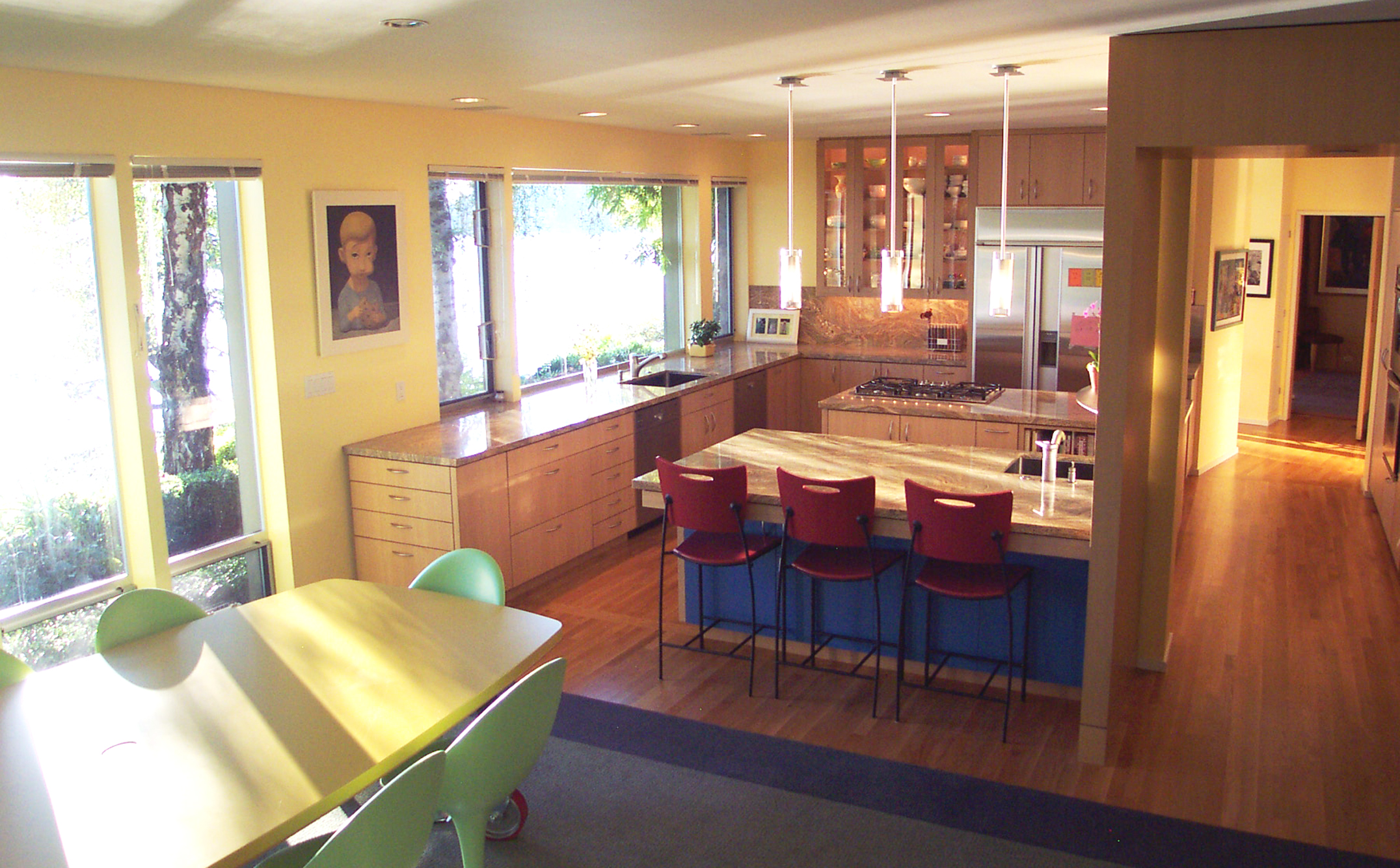
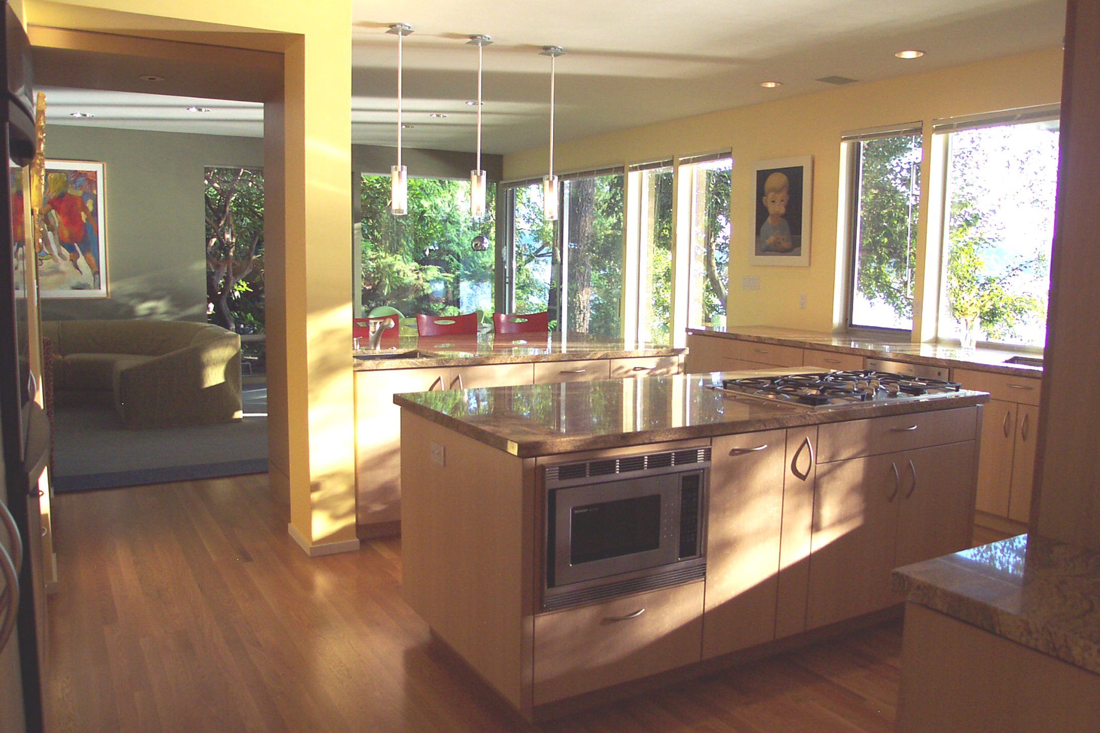
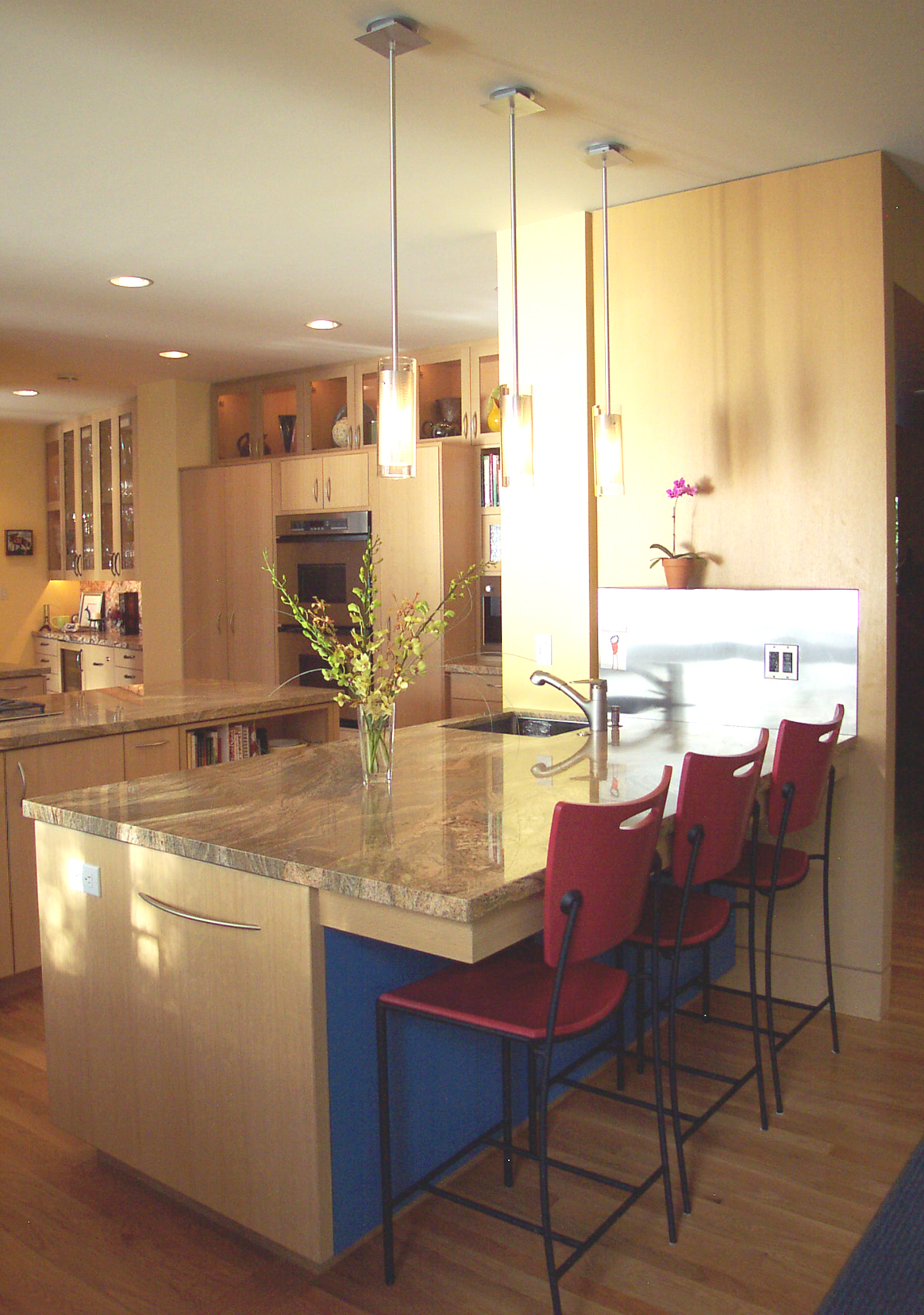
Thick slabs of sand-textured granite and quarter-sawn white oak cabinets, equipped with special compartments for things such as cutting boards and plastic container lids, replaced old, sun-exposed cabinetry. A major transformation happened when the the low-height partition, separating the family room and kitchen was knocked down to allow in more light and warmth from the west-facing windows. The placement of the stovetop was adjusted to assist the left-handed couple, and a large 4-foot by 8-foot backing counter was added for the girls.
SZ made 'homes' for everything in the kitchen, from a state-of-the-art Miele integrated coffee station for Cameron to special cabinets for the Dean & Deluca spices that Linda likes to use. To accommodate Linda's petite stature, the countertops were set at a lower height. SZ even designed cereal-box-specific cabinets to ensure that everything would fit just right. Low-voltage strip lighting, operated with dimmers, borders every glass cabinet and spotlights the couple's funky '60s-inspired Jill Rosenwald ceramic serving pieces and a favorite clay sculpture entitled Love Entwined that they bought in Paris.
Today, the kitchen is almost unrecognizable from its former self. A dramatic evolution from stark and imposing to bright and spacious the clean lines and warm tones still give the family-functional space a grown-up edge. "if we're not hosting a charity event or inviting a group of 20 kindergartners over for a party, you'll still find all of us int the kitchen," says Linda. "Except how it feels right. The kitchen has our personalities stamped all over it." Not to mention a few handprints from three little girls.'
- Janna Chan is a Seattle-based freelance writer.
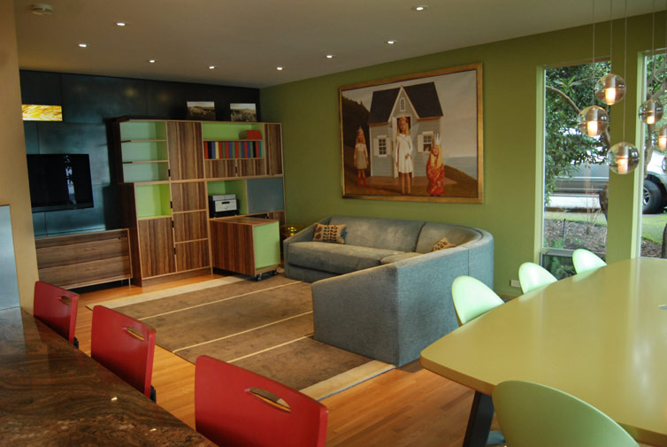
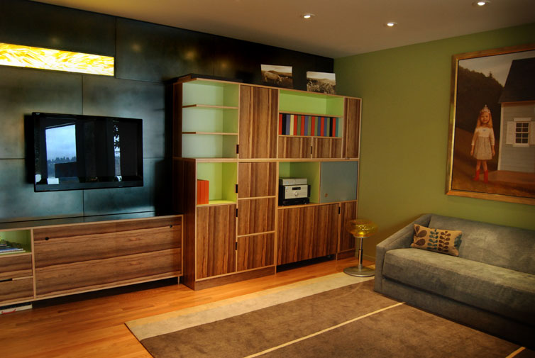
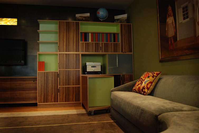
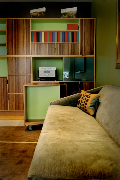
In the family room, SZ designed shelving and a cabinet system that was built by Kerf Design. These simple yet modern black limba wood cabinets, detailed in an exquisite and playful way, house many toys, office material, a printer, and a stereo. A work-post pivots out from inside the cabinet to easily operate audio-visuals and serve as a homework table.
Next to the cabinets, SZ designed a series of blackened steel panels that act as a backdrop to a flat screen TV. The black screen, once turned off, disappears against the texture of the dark panels. When it is turned on, it resembles a vibrant painting against its setting. A horizontal slit in the wall above the TV completes this corner. The rich yellow-gold hue of Peter David art glass lights up the otherwise dark tones.
Within one sweeping motion – from kitchen, dining area, and family room – the design has been addressed in a functional way. By accentuating the separate character of each environment, the whole results in a sensual and complex space within modern guidelines.

